Designed for phones first
Each page is laid out for a small screen first, then given more room on tablets and desktops, so the phone version never feels like an afterthought.

Web Design & Development
Most of your visitors will arrive on a phone, and some will come back later on a laptop. I design each page for both from the start, so the layout, text and buttons work properly at every size.
One site, every screen
White Buffalo Bespoke
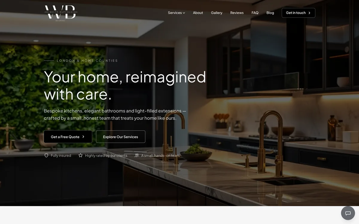
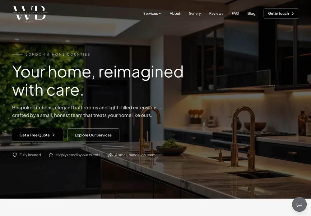

Each page is laid out for a small screen first, then given more room on tablets and desktops, so the phone version never feels like an afterthought.
Columns stack, menus fold away and images resize in an order that still reads well, with the most important content kept near the top on a phone.
Calls, contact forms and booking buttons are sized and spaced for a thumb, with phone numbers that open the dialler.
Phones get smaller image files and desktops get sharper ones, so pages load quickly on mobile data without looking soft on a big monitor.
Every page is checked at phone, tablet and desktop widths in the main browsers before launch, including landscape tablets.
Google looks mainly at the mobile version of a site when it decides rankings, so the phone layout gets the same care as the desktop one.
Step 1
We agree what each page needs to say and what a visitor should do next, because that decides what goes at the top of a phone screen.
Step 2
I design the key pages at phone and desktop sizes side by side, so you can see how each one changes before anything is built.
Step 3
The site is built to adjust smoothly between those sizes, then tested on phones, tablets and desktops in the main browsers.
Step 4
After launch I check the live site on real devices and in Google Search Console, and fix anything that shows up.
Yes. Every website I build works on phones, tablets and desktops as standard. It's part of how the site is designed and built, so there's no separate mobile version to pay for or maintain.
Tell me about your business and your current website, and I'll come back with an honest recommendation, timeline and price.
Start a project